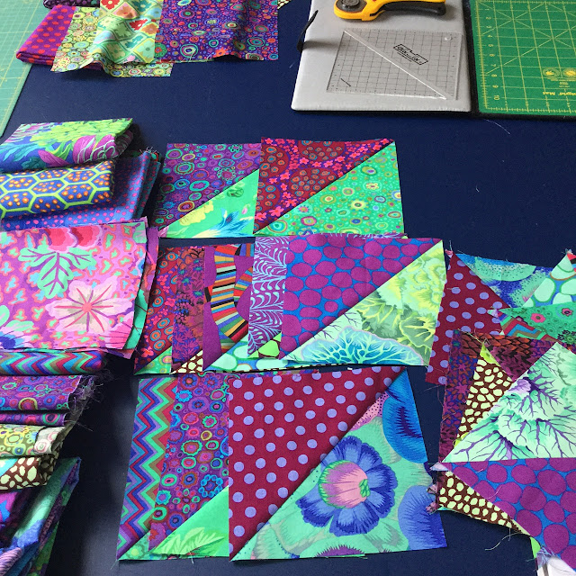
I remembered the things Kaffe and Brandon had told us at the class I attended a year ago, and just used whatever fabrics I had on hand. I didn't try to match my fabrics to those in the pattern. If I really like a fabric, I cut more of it. Those I wasn't so fussed about, I used less of.
I have a Bloc Loc HST ruler for 6" finished blocks, so I made my blocks slightly smaller than the pattern. My quilt will be 60" x 60" rather than 80" x 80" (unless I decide to add more blocks).

In my mind this was going to be a green quilt, with purples in the background, so I laid out the blocks by pairing up the green fabrics (see below) . I knew it wasn't looking as good as I hoped, but I couldn't think why after a long day making 100 HST blocks.
I sat down to relax and immediately realised that I should have paired up the purple fabrics because they were stronger colours. The next morning I tried again and was far happier with the layout (see below). It looks much cleaner now that the focus is on the purples. The greens still glow in natural light, but the purple diamonds work far better this way.
I've now started joining the rows, but once again I've had to pack it all up because this is my kitchen floor and we need to eat! It's bringing back memories of when I made my Tropical Hexagons quilt and had the same problem. Must be a thing with Kaffe Fasset quilts.


20 comments:
Your Kaffe stash must be fabulous. I much prefer your colours to the ones in the book.
Those Kaffe fabrics are so rich and sumptuous aren't they? I love the purple/green palette you've chosen Wendy! I agree with Julie, yours is far nicer than the original!
This is going to be a stunner! I'm a sucker for KF prints and you've made beautiful choices.
Dein Quilts werden wunderbar. Ich habe mir kürzlich einen LayerCake von Kaffe Fassett gegönnt :-)
Gruß Marion
Amazing the difference when you move around the color from the green to purple.
Another beautiful quilt. I like the layout better on the second try. The floor is where I work...and have to pick up when the day is done. It seems inevitable but still I appreciate I have someplace to work.
Such great use of your fabric!
Looking lovely Wendy.
I love the quilt. I think I am going to have to find a pile of busy prints and do this. I only have some Kaffe material
Oh they are both gorgeous quilts, how lovely to play with such pretty fabric :)
this is coming along beautifully, what a funny name for a quilt! Like you the kitchen floor comes in handy here too. Loving your kitchen too
That's amazing the difference in the block placement! Thanks for showing us the difference - very good visual! Your quilt will be lovely!
This quilt is going to be beautiful! I agree, matching the purples works much better. I had to look closer to see the difference but once I understood, I couldn't NOT see it. I agree with someone above--your KF collection must be tremendous! And they are gorgeous!
The quilt is going to look lovely once it is finished, I like making smaller quilts nowadays, they don't take up as much space when trying out different layouts. Good advice to cut more of the fabric you love.
beautiful color combinations! what a rich quilt
Hello Wendy, From grey and overcast Adelaide.I wanted to say how much I enjoy reading your blog and enjoy seeing what you are currently making.So thank you and I look forward too seeing more from you.
Beautiful, Wendy! I can see the difference in the second picture, but I can't quite figure out how the different pairings make the difference. I can see I'll have to study that beautiful quilt some more.
Another great quilt, Wendy. It took me some scrolling back and forth between your layouts and the photo from the book to finally figure out why Kaffe's quilt didn't have a clear sense of being a "two-color" quilt. He had to have laid out the quilt pieces before sewing any of the triangles together so he could match fabrics going both ways in every block. Another big difference is the values of his fabrics and color choices. In your quilt, the purples are definitely darks, the greens are not-so-darks. Thus, even though the level of organization may be greater in Kaffe's quilt (pieces match going all directions), it doesn't seem as organized as yours does, simply because of the value. Your quilt really emphasizes value over color, while his isn't really clear on what it emphasizes! Thus, his looks less oranized even though technically it is more organized. Sorry if this is a little too academic, but I puzzled over what was going on for some time. Once again, you've created another beauty!
P.S. As I look at Elizabeth's comment above, looks like she was pondering over the same issues I was! I always did like the way she thinks.
Thank you for taking time to put into words what was going on. I learned alot.
Post a Comment